Revamping is basically the art of taking a sprite from one of the older games and recoloring/shading it to the quality of a post-Advance counterpart. Newbies in the field do this simply as if they were doing a slightly more complicated version of a recolor - they replace the colors, though using different colors for the different parts, save it and call it a revamp.
That is not a revamp, it's simply a recolor. Don't do that. Ever.
The Rules of Revamping
Thou shalt not make Dots.
Thou shalt edit the outlines and shade them.
Thou shalt edit and add shading where it seems appropriate.
Thou shalt mimic thy Advance sprite closely, and closely shalt thou mimic thy Advance sprite.
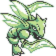
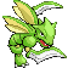
Now, say I'm going to revamp the Yellow version Scyther, since I'm being Scyther-obsessed in this guide. Here it is:

It doesn't look that bad for a sprite with only four colors, does it? However, if we make the background black instead of white...

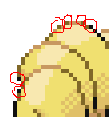
...not anymore. See those dots around the outline? This is a problem in the older games, especially Yellow (there's a reason I chose the Yellow sprite for this tutorial). On a white background, like in the Game Boy and Game Boy Color games, this would smooth out the outline so it wouldn't look as jagged as it otherwise would. But on a dark background, this is a nightmare. I call those pixels Dots. (By the way, to my knowledge, I invented that term, so if you're going to talk about spriting to somebody, don't start going on about Dots unless you're absolutely certain that the person you're talking to has read this guide, okay?) Let's put it on a white background again to make it clearer what I'm doing, but knowing this, we'll of course fix the Dots a bit later. I'll make it a little larger, too:
See what the Dots are now? They're lighter pixels on the outer edges of the outline. Now, while this sprite has a lot of Dots, it has pretty good shading. It uses white for the highlights; the lighter shade of green for the base color; the darker shade of green for the shadows and outline highlights; and black for the outline and the very deepest shadows. Additionally the artist appears to have had a pretty good idea of where to shade and where not to shade. In Gold, Silver and Crystal, they put the right colors higher in priority than shading, so the shading in many G/S/C sprites is same as nothing apart from small white highlights. In R/B/Y, the two colors to use were two shades of the same hue, as the games were of course originally designed for the Gameboy that used only black, white and two shades of gray. Anyway, this means that we won't have to make the shading up, as is the case with G/S/C sprites. So we can now go and color the Scyther to be shaded exactly like the original Yellow version sprite, but with Ruby and Sapphire colors (don't think about the outline for now). We do that pixel by pixel with the Pencil tool, NOT with the Paint bucket tool, since we don't want to accidentally fill half of the wings with green. Then we color the entire outline black, including the Dots. Let's see how it looks now...

With the outlining black, however, it looks very 2-D and cartoony. That is, not how we want it to look. Plus, there are some clusters of black. To fix that, we take the base outlining shade for every color and color all of the outline except the shadows in that color, and remove the clusters.
Remember, you must not make Dots again! There are some in the R/S sprite, but do NOT put them on your revamp. You could, on the other hand, make Reverse Dots, as seen in this example from my fixed-up FR/LG Ninetales:
As you can see, there are darker pixels on the edges of the outline in some places. This will make the sprite look really smooth against a dark background, unlike the Dots which practically wreck it on a dark background. This does not make the sprite look less official either, nor does it ruin it on a light background, so there is no reason not to do it; the official sprites aren't perfect but you want your sprite to be. ;)
Let's see how our Scyther looks now with this applied to it...

Hmm, technically it doesn't look too bad. But what if we compare it to the R/S sprite?

Notice how the Yellow version one looks different from the R/S one. The wings are shaded differently on the R/S sprite, and the R/S one seems lighter. Why? Well, the original Yellow version Scyther had white highlights, which contrasted much more with the green main color. The highlights were really used to apply shine, so very little of them was used. The R/S Scyther, on the other hand, has the highlighting color all over. It is clear that we need to change the shading to the style of the official Scyther. Also, we'll need to do a bit of outline highlighting; put some of the shadow/outline highlight color on the outlines where they are very lightest, trying to keep the quantity of those similar to that on the R/S sprite. Note that you still should not make Dots.
Also, we can look at the FR/LG sprite for reference for some more edits like in the face, since even though we're coloring it R/S style, the pose is a lot more similar to the FR/LG sprite (in fact, the FR/LG sprite is really a remake of the Yellow pose). That's where I got the red in the mouth from, too.

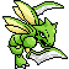
Whee, finished. Try looking at this in a style with a black background and noticing how it's even smoother than the R/S sprite, thanks to Reverse Dots.
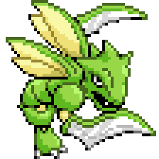
Done! We changed this:
Into this:
Now, what about a Gold, Silver or Crystal sprite with practically no shading at all? Let's try the... *finds random G/S sprite that has almost no shading* Silver Pikachu. Here it is, with the R/S sprite beside it:


Let's magnify it as usual:
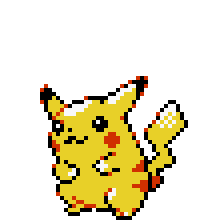
See the Dots? Especially on the ears? We must clearly fix them. So, first things first: color and make the outline black.


Ick. See how it really doesn't look that much better than the original sprite? That's because there is almost no shading. Some people actually try to revamp Gold/Silver sprites, and just leave them like this. Don't do that. Ever.
Now, see those highlights? The spots that used to be white? They're facing the top left. (In fact, all Pokémon sprites have their light source in the top left, or rather top and the direction they're facing.) So clearly, that's where the light is coming from, and thus you shade exactly where it's not coming from. When you shade, you add the shadow color where the light would not fall. Pikachu is mostly made of curved surfaces, which means that the shading should also curve around the shape of the body. The tail is not curved; however, it is behind Pikachu and should therefore have a lot of shadowing except at the top. (Look at the R/S sprite for reference!) For more help on shading, see the in-depth tutorial on shading.
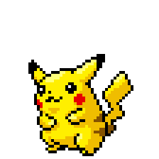

Much better and more 3D. Now proceed to shade the cheeks and the stripes (look at the R/S sprite for reference again.) You see that the black ear tip is bigger on the R/S sprite than on this one's left ear (our right); therefore, make it a bit bigger before shading it. Look at the R/S face for reference when shading it, too. Oh, and some of the highlights look a bit awkward, so change them.


Outlining! Now, Pikachu has four shades in its outlines rather than three: there is one dark brown and one medium brown which both are darker than the light yellowish brown that is the actual shadow/outline highlight color. Treat the lighter of those two outline browns as an outline highlight color and the shadow color as an extreme highlight color, only for use on the very lightest areas. Incidentally, this lighter brown is also used on the R/S sprite for the extreme shadow on the foot - I can use it in that way on the revamp, too.
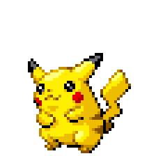

And now it should be finished. Let's look at it:
Yup. This:
Into this:
And that concludes the revamping lesson. Get experienced at this, especially shading.
Listen to this dude.He knows what He's talking 'bout. Your Assignment is to revamp a Sprite, By following the Steps Above. Have it in By Sunday Morning.


 ... MR. BLOOYASH
 So, how does it look? Did I pass?